Logo Design: Cuppa Joe
Summer 2025
To create a modern, functional, and sustainable brand identity for a ready-to-drink Cold brew that aligns with the values of health-conscious, eco-aware young professionals.
Objective
Cuppa Joe was started in 2021 with the goal of helping young people stay awake and focused with great coffee. The idea was to keep the same kind of care and personality you’d find in a local coffee shop, but make it more accessible and fun.
Though the first logo worked for a little while, My client is ready for a new look. The original logo doesn’t really match the vibe anymore, so it’s time for a redesign. The new logo should feel playful and creative, and it should include the name in a way that either stands out right away or makes you think a little.
The Brand’s History:
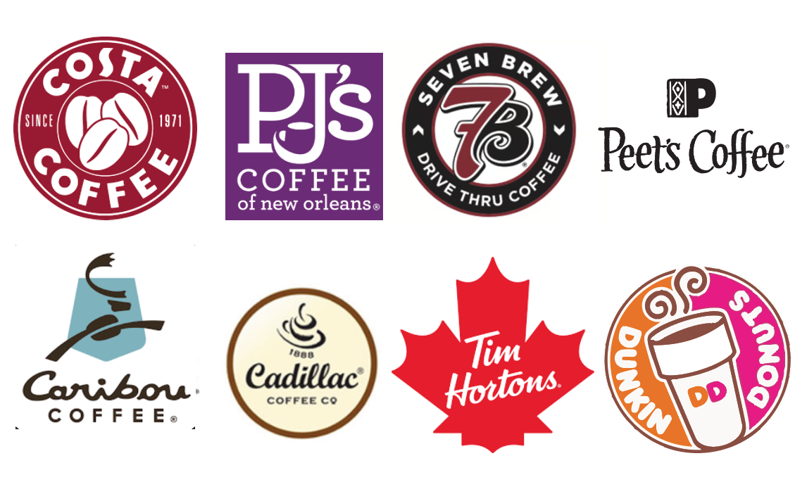
After completing research on successful coffee shop logos, I concluded that most of the logos were more on the literal side, but still had one or two unique characteristics that made them stand out.
Research:
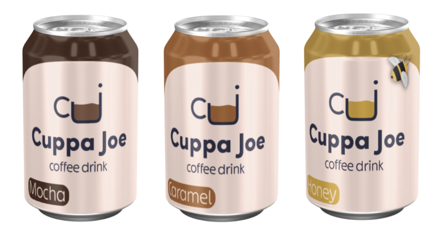
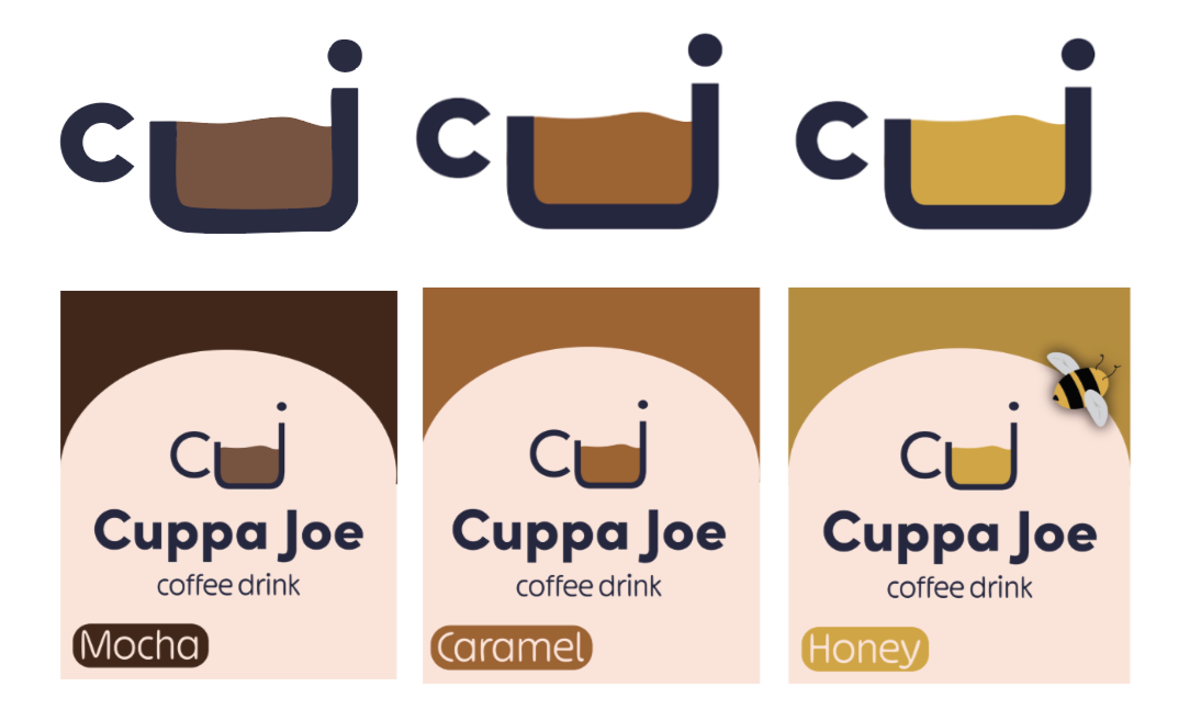
The logo combines the initials “c” and “j” in a minimalist form, with the “j” doubling as a coffee cup. The brown fill represents the mocha cold brew, while the clean lines reflect the brand’s modern and functional identity.
Logo ideation:
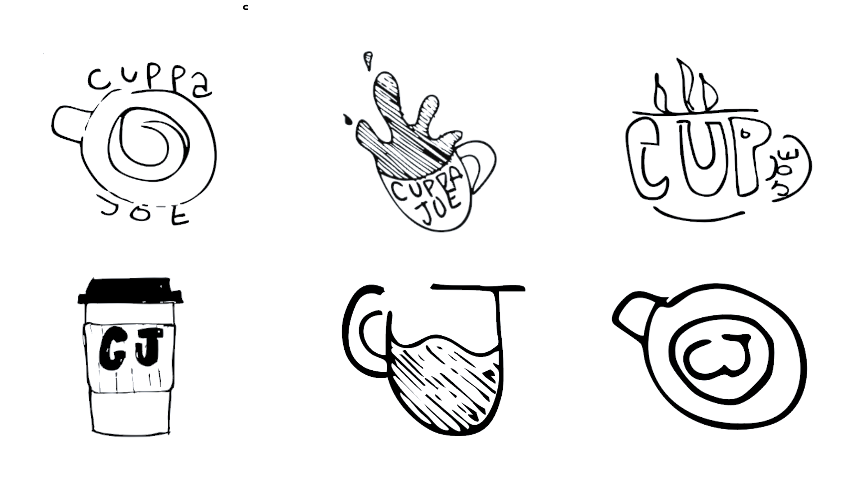
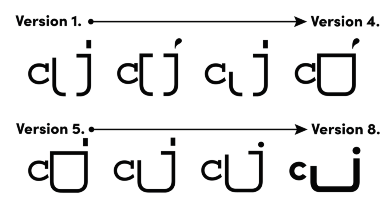
The Cuppa Joe logo evolved through eight distinct versions, each refining the relationship between the C and J to better express the brand’s identity. Early versions explored proportion and alignment, while later iterations focused on simplifying the form and enhancing visual balance. The final design transforms the J into a coffee cup with the C as its handle, creating a clean, modern symbol that captures both the product and the brand’s calm, functional energy.
Logo Iterations
I selected Sofia Pro for its geometric, sans-serif structure that feels both modern and approachable. Its forms play into the brand’s calming energy, while its clarity ensures strong legibility across digital and physical formats.
Typography studies
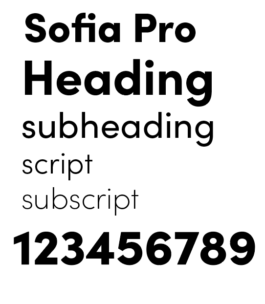
Final Typeface:
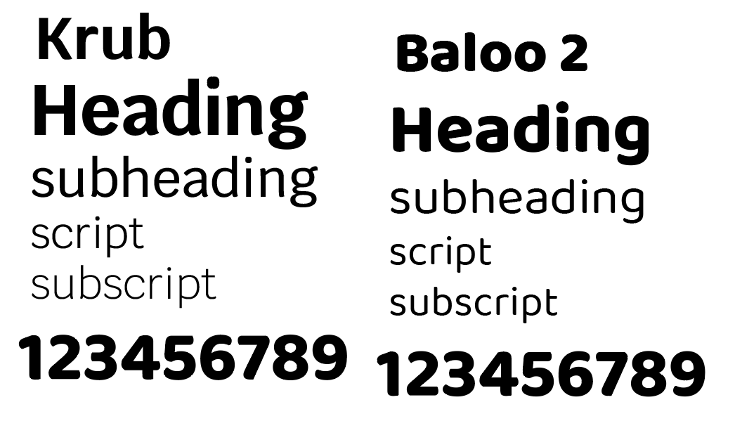
Typeface studies:
After completing my color studies, I realized. I wanted it to feel warm and welcoming, but I also wanted to add something new. So I came up with the idea of using one main accent color that changes depending on the drink’s series or flavor. It keeps things consistent, but also adds a fun way to tell the drinks apart.
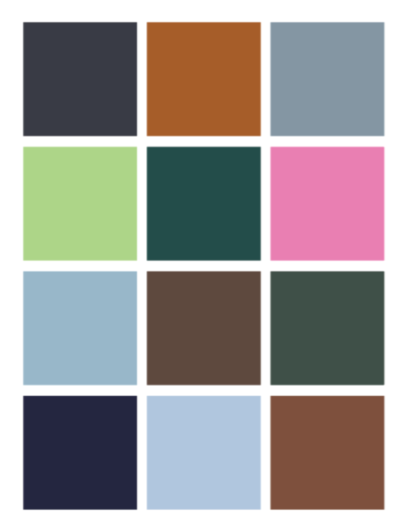
Color studies
Final colors:
Color Studies:

Final