Advertisement: Poster Series

Spring 2025
Objective
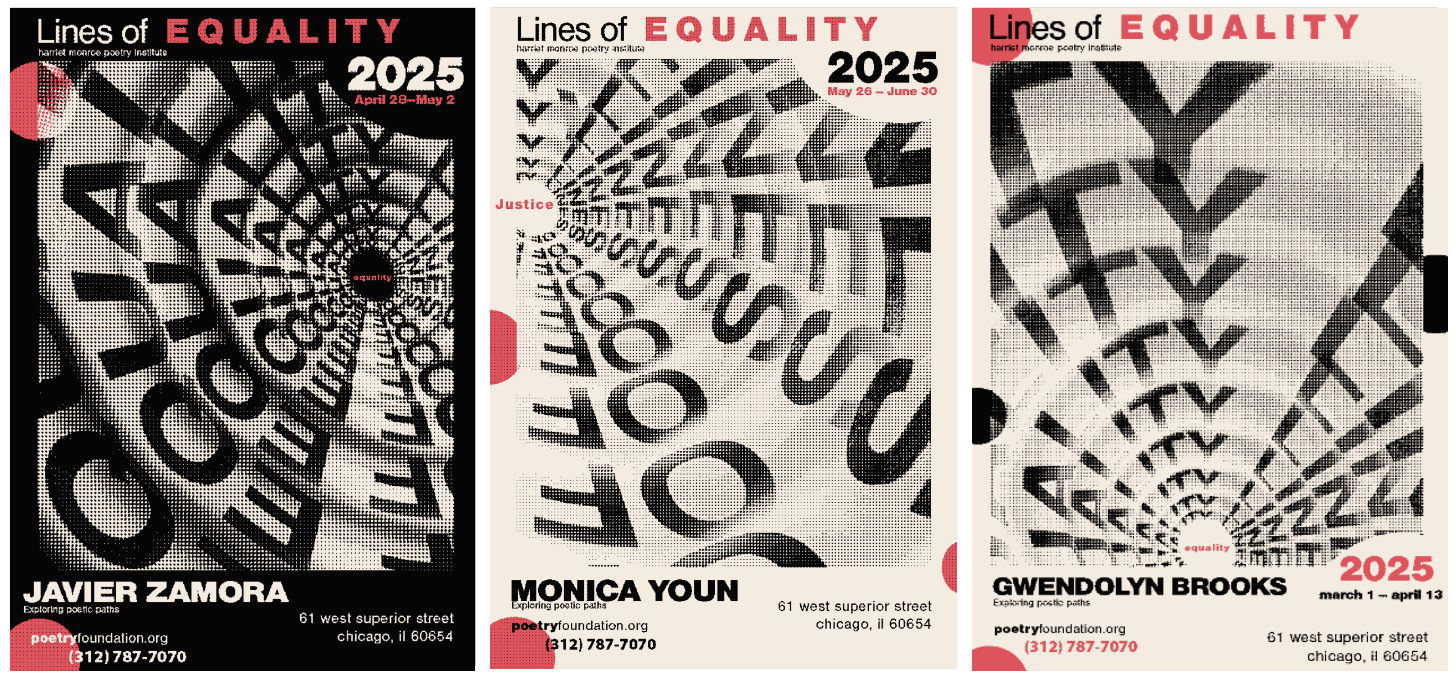
To create a visually compelling poster series that promotes the Lines of EQUALITY poetry events, featuring Gwendolyn Brooks, Javier Zamora, and Monica Youn. The posters aim to draw attention to the poets’ powerful voices and invite the community to engage with themes of resilience, identity, and social justice.
The Why?
This series was designed to connect the community with poets whose work reflects their lived experiences and cultural histories. The posters serve as both an invitation and a tribute, encouraging audiences to explore the poets’ journeys and understand how their words illuminate the struggles and triumphs of marginalized communities.

Javier Zamora
Is a Salvadoran-American poet and activist, has significantly influenced literature and society through his poems and stories, such as Solito and Unaccompanied. His work, inspired by his own unaccompanied child migration from El Salvador to the US, combines El Salvadori literary traditions with his experiences across borders, challenging conventional narratives and stereotypes about immigrants.
The Who?

Monica Youn
is an American poet and lawyer, has made significant contributions to literature and society through her experimental poetry collections. Her work explores themes of identity, race, and immigrant experiences, drawing from Greek and Nordic myths. She addresses social and political issues of the 21st century, such as anti-Asian violence and the model minority myth. Youn's writing provides a powerful voice for marginalized communities.
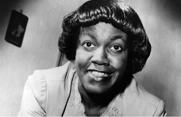
is an American poet, was the first black woman to win the Pulitzer Prize for her 1950 book "Annie Allen," breaking racial barriers in literature. Her innovative approach, influenced by the 20th-century social and political transformations, showcased traditional forms and marginalized characters.
Gwendolyn Brooks
Final color selections
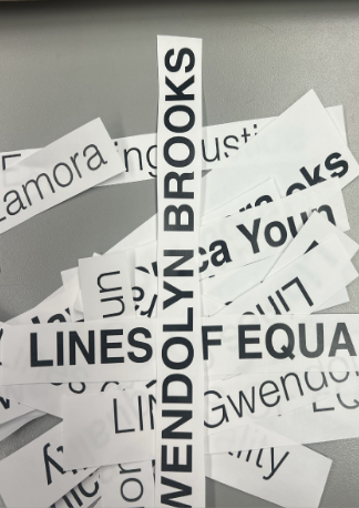
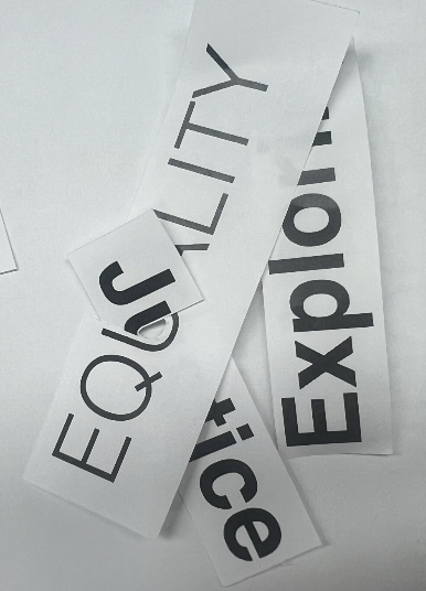
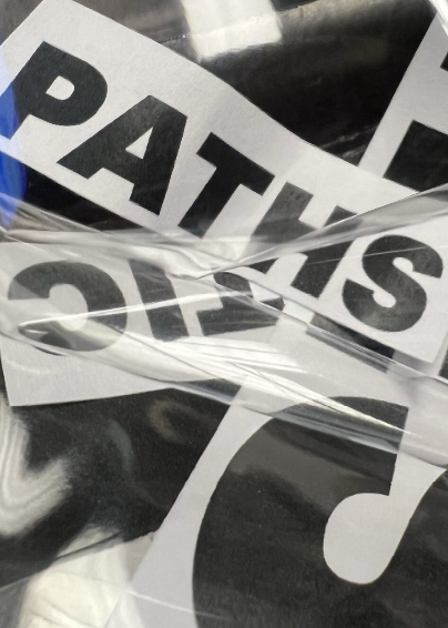
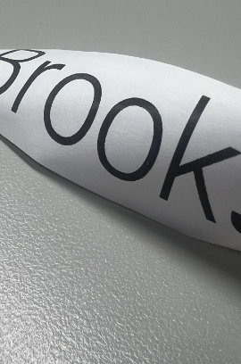
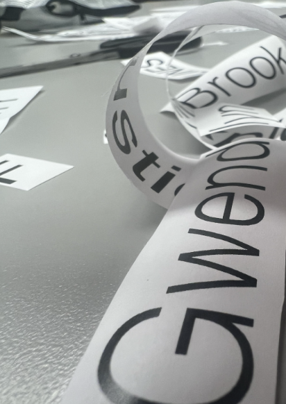
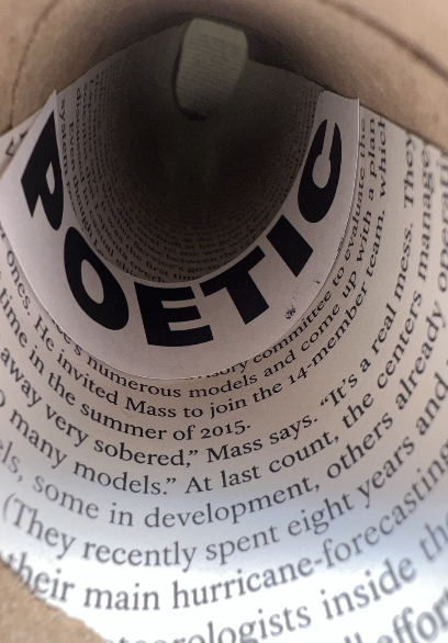
I started by cutting, twisting, and layering printed words like “justice,” “equality,” and the poets’ names to see how they interacted visually. I played with different layouts and textures to explore how meaning could come through form. This hands-on process helped me figure out what felt powerful and what didn’t, which led to the spiral and layered text ideas that made it into the final posters.
Experimental Play

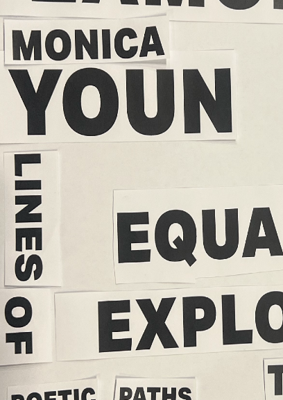

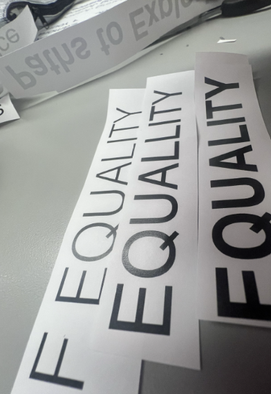
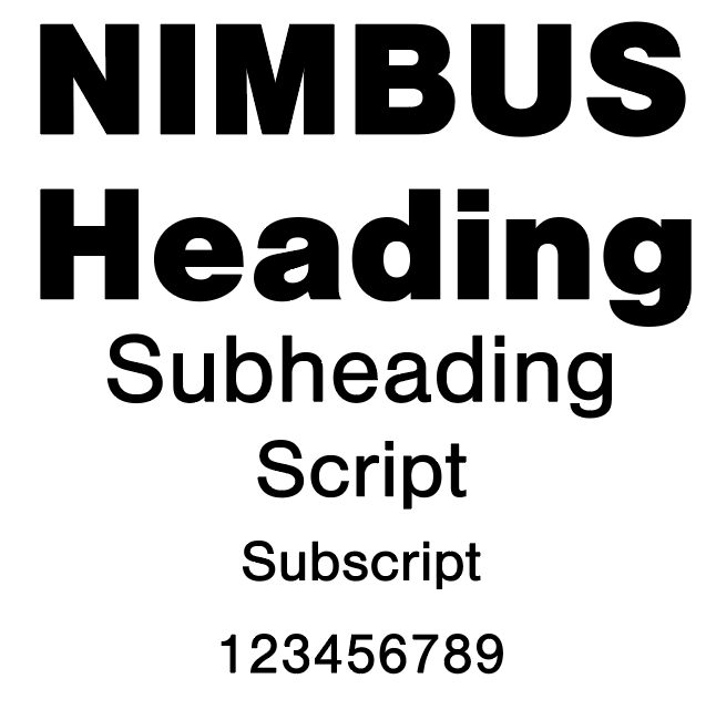
A bold sans-serif typeface was chosen for its clarity and strength. It ensures that names, dates, and titles are immediately legible and impactful, reflecting the boldness of the poets’ messages and the urgency of the themes they explore.
Typography Studies
Final Typeface:
I explored a wide range of colors during the design process, from green tones and browns to deep blues and grays. After testing different combinations, I chose a final palette of black, light cream, and coral red. These colors felt bold but balanced: the red grabs attention, the cream softens the tone, and the black grounds the design. My color choice was influenced by the Constructivism era, which I found to be very powerful, Which helped emphasise the shout, talk, and whispers of my posters.
Color Studies


Final