Flight Information Display System
Spring 2025

To design a clean, easy-to-read flight tracking app that helps users, especially those new to flying, navigate airport information with confidence. The app focuses on legibility, wayfinding, and accessibility to reduce stress and confusion during travel.
Objective
The Why?
I created this design thinking about how overwhelming travel can be, especially for first-time flyers. I remembered how nervous I felt the first time I drove on the highway—and how much it helped to have clear directions. This app is meant to be that same kind of guide: simple, direct, and reassuring.
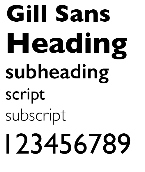
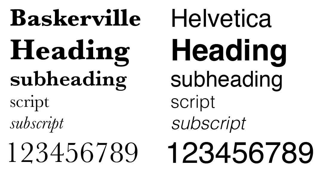
Typeface Studies
I explored several typefaces: Gill Sans, Baskerville, and Helvetica Neue, to find the right balance of clarity and modernity. I chose Helvetica Neue for its clean, neutral look and excellent legibility. It works well at both large and small sizes, making it perfect for an app where users need to quickly scan flight details.
Final Typeface:
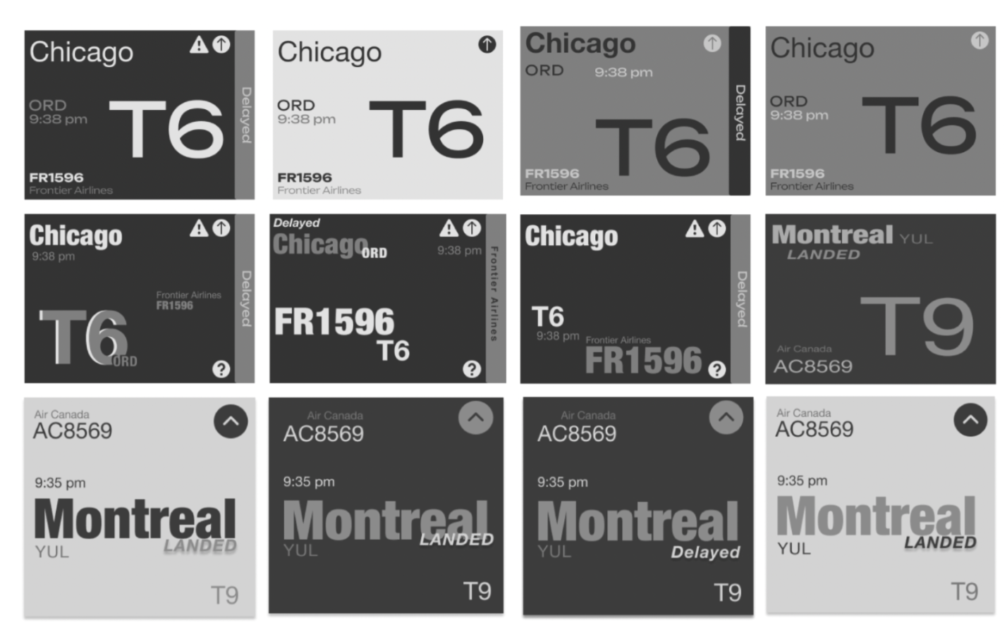
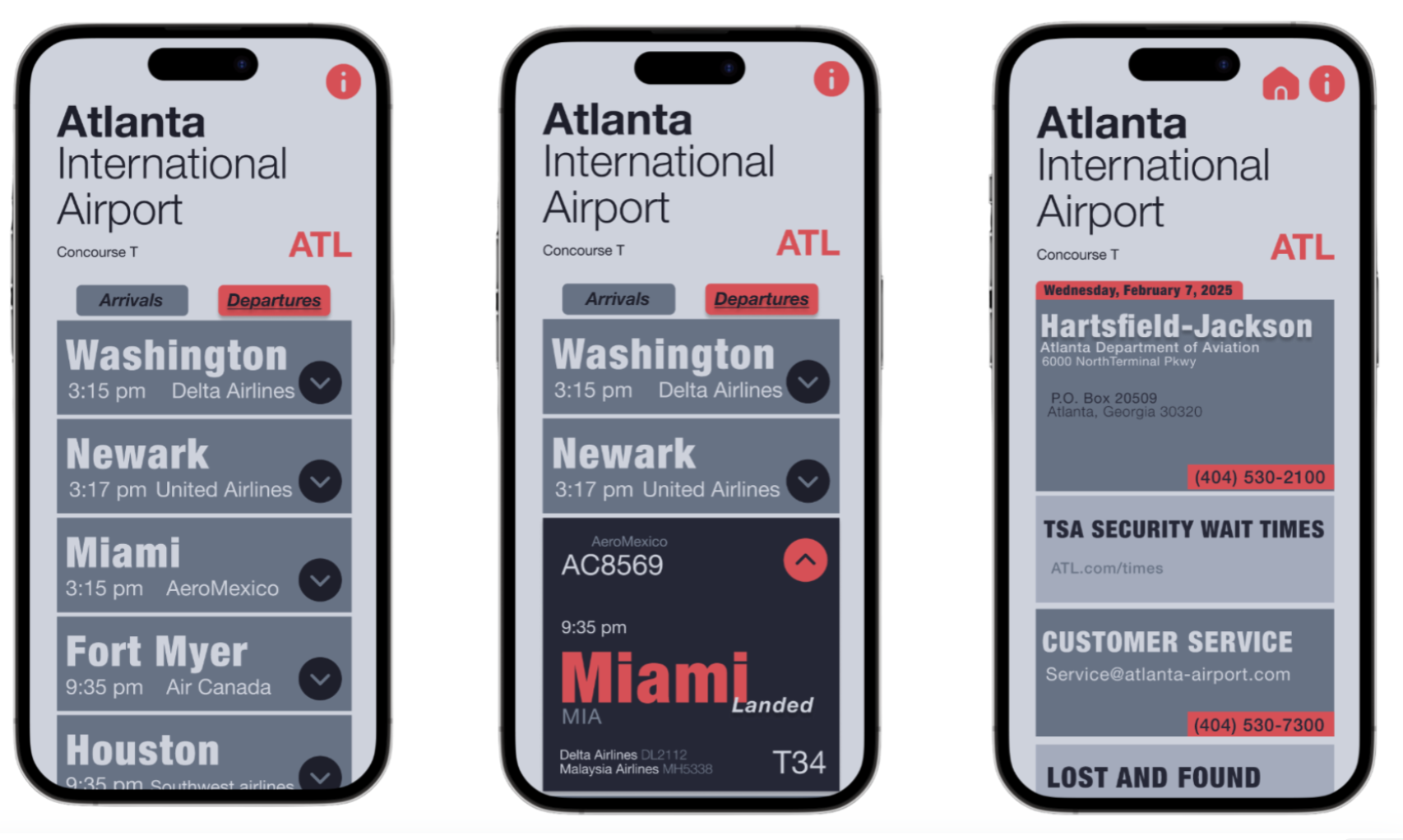
I explored different ways to organize flight information so that the most important details like departure time, gate, and flight status stand out first. I tested layouts that guide the eye naturally from top to bottom, making sure users could quickly find what they need without feeling overwhelmed.
Hierarchy Studies:

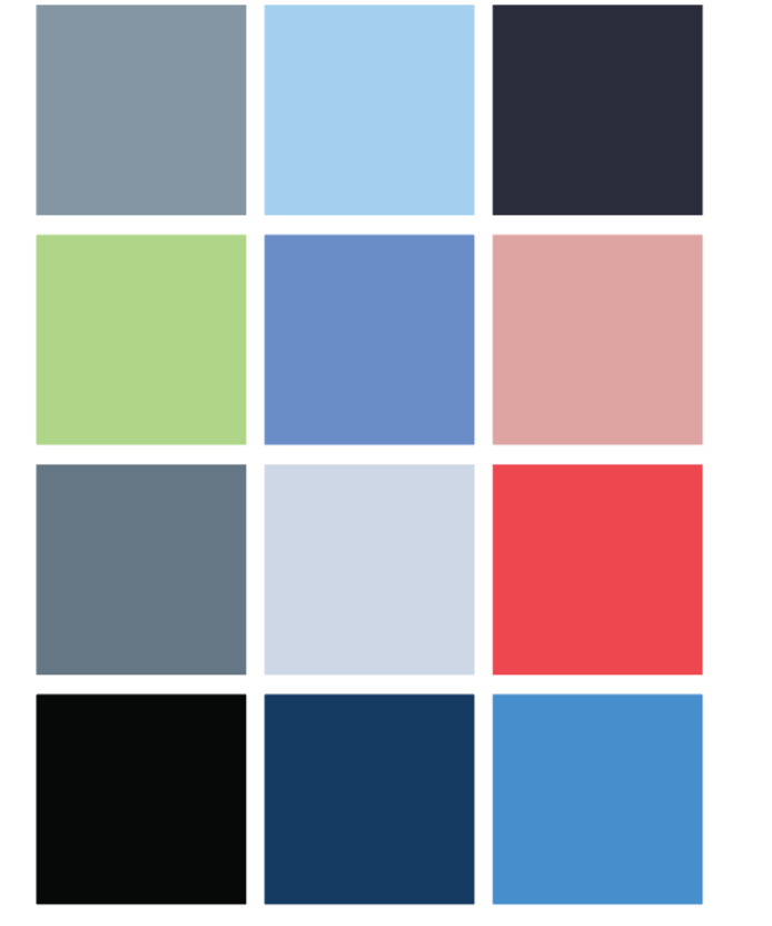
The goal was to find a palette that felt calm but still made key info stand out. I landed on a mix of light blue, deep navy, red, and dark gray-blue. These colors help organize the screen visually: blue tones guide the eye, red signals urgency, and dark shades keep everything grounded and easy to read.
Color Studies:
Final
Typeface studies:
Final Colors:
Color studies: